THE BRIEF
Tony’s Chocolonely is on a mission to make 100% slave-free chocolate the norm. Their bars are loud in voice, disruptive in design, and uncompromising in ethics. But in a category overflowing with sameness, we saw an opportunity to turn the chocolate — the actual product — into an iconic, craveable visual asset.
We were briefed to increase their taste appeal. One of the key challenges Tony’s faced was that they rarely showed the chocolate itself, which meant consumers didn’t fully appreciate it for its rich, delicious taste.
They asked us to define a culinary identity in a distinctive, consistent way to showcase their bars across all touchpoints — a new visual language that matched their purpose and made people fall in love with the chocolate before even taking a bite.
The Culinary Identity
We started by asking: What makes Tony’s chocolate different?
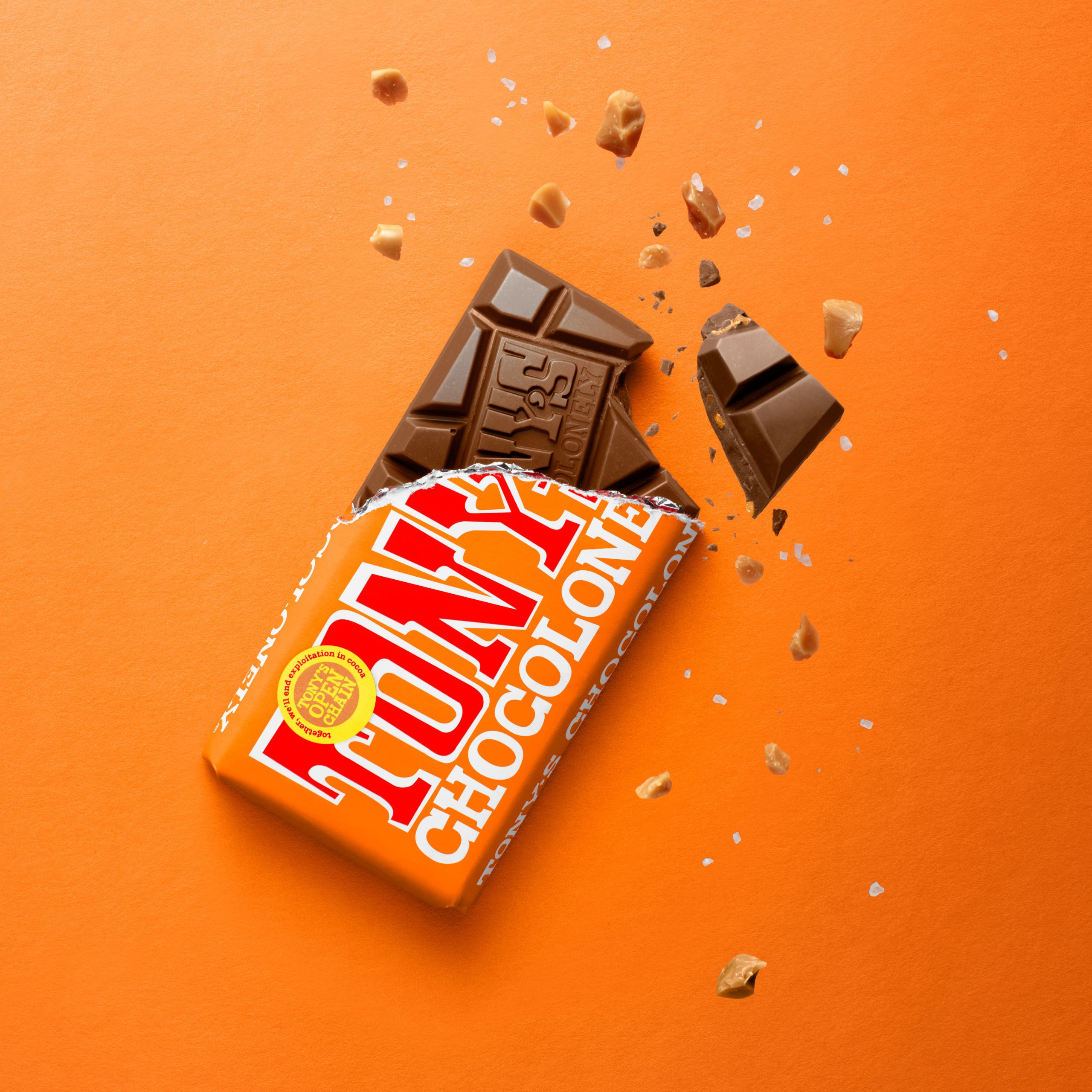
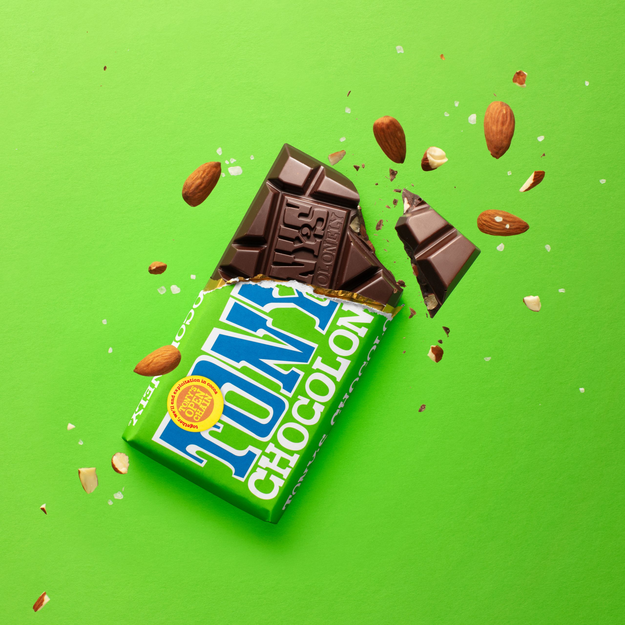
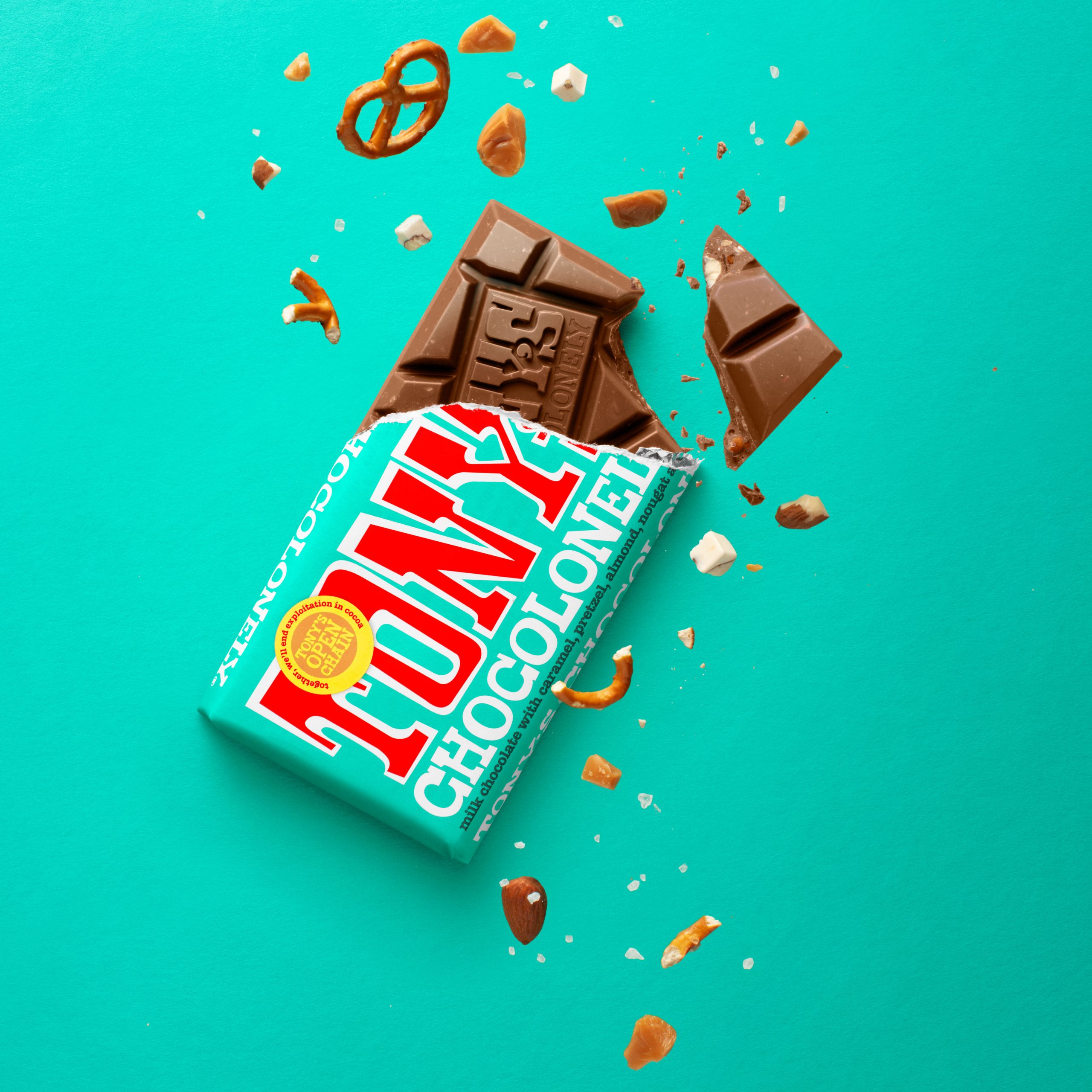
The answer was literally in our hands — the chunkiness. Not just in size, but in meaning. The uneven chunks symbolize the inequality Tony’s is fighting against. It’s an intentional design with a story baked into every bar. We uncovered a beautiful consumer truth: when people open a bar, they instinctively snap off the two end chunks first. That insight sparked an idea — what if those two satisfying pieces became the visual embodiment of everything Tony’s stands for?
We gave them a name: Neil. Inspired by Neil Armstrong, he represents firsts, impact, and the audacity to leave a mark. Neil isn’t just a chunk of chocolate — he’s a storytelling device. His broken, uneven sides show texture and inclusion. His angle is distinctive. His presence is craveable.
Neil became the core of Tony’s culinary identity — a visual system designed to make the chocolate instantly recognisable, even without a logo.
- Neil must always be broken, never cut. He’s tilted, never flat. Surrounded by crumbs and inclusions that speak to real flavour and texture.
- The Golden Ratio: Two-thirds of the bar wrapped, one-third unwrapped. This highlights both the iconic wrapper and the chocolate underneath — with its embossed name and signature chunkiness.
- 66° Tilt: Every bar image balances at a specific angle derived from Tony’s own design codes.
- Paper Texture Backgrounds: Every shot rests on real paper, grounding it in tactile quality.
- Colour Matching: Backgrounds match the wrapper colour — or default to Tony’s signature red when showing multiple bars.
- Ingredient Inclusions: Whole, crumbed, and chunked ingredients are used to evoke flavour and enhance appetite appeal.


