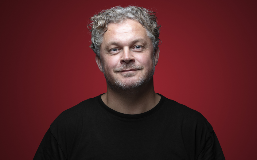
Erik de Koning, Director at Chuck Studios, was tasked with elevating Lipton’s Pyramids and Yellow Label Black Tea campaigns and orchestrated a visual feast that, in many ways, transcends the boundaries traditional advertising.
By focusing on the luxurious essence of the Pyramids range and the rich sensory allure of Yellow Label, his team transformed simple tea bags into captivating narratives. Through innovative techniques and a deep understanding of brand identity, de Koning not only showcased the exceptional quality of Lipton’s teas but also redefined how we experience a humble cup of tea.
In this interview, de Koning delves into the creative journey behind these campaigns, sharing insights on overcoming production challenges, such as achieving the perfect milk cloud effect and ensuring tea bags remained submerged during filming. He also discusses the importance of aligning the visual storytelling with Lipton’s brand values and consumer expectations, particularly in markets like Pakistan, where the strength and quality of tea bags were under scrutiny. Through this conversation, readers gain an intimate look at the meticulous planning, innovative problem-solving, and collaborative efforts that culminated in campaigns resonating with audiences worldwide.
What was the brief?
For the Pyramids range, the brief was to hero the product quality, emphasising its exceptional ingredients from renowned origins within a uniquely shaped pyramid. Whereas, the Yellow Label Black Tea, the focus was to drive sensorial appeal by romanticising the hero teabag in all its glory, showcasing its richness and bringing the concept to life through evocative visuals.
How did the initial pitch/brainstorming phase go?
It was more of a brainstorming. Five different concepts were developed, and Lipton selected the one that best aligned with their vision. This selected visual then served as the foundation for the script and shot list.
What was the process behind ideating the concept?
The team worked from a single key visual and built a narrative around it. For the Pyramids range, the idea revolved around a reflection concept– showing the tea bag above the water and its flavours reflected below. For Yellow Label, they focused on sensorial elements like light, movement, and the richness of colour to showcase the tea’s superior taste.
What was the production process like?
Production lasted three weeks to a month per project but was streamlined by our prior experience working with Lipton and testing materials for tea bags and mock-ups. The Pyramids campaign was shot with a more luxurious aesthetic using gold and glossy textures, while the Yellow Label shoot emphasised Lipton’s signature yellow branding and the richness of the tea.
What was the biggest challenge during production? How did you overcome it?
A major challenge was ensuring the tea bag stayed at the bottom of the cup rather than floating. The team had to repeatedly soak and dry the tea bags to achieve the right effect. Another challenge was capturing the perfect milk cloud for Yellow Label, which required careful timing and liquid testing. We actually ended up using condensed milk!
What kit/tools/software were used to create the project?
To create this project, here is a list of the main kits and tools we used to create the Lipton work:
Video editing/retouching software: Davinci Resolve
Photography capture software: CaptureOne
Concept ideation software: Photoshop/MidJourney/Keynote/
Camera: Phantom high-speed camera + Arri Alexa Mini.
Photography: Canon 5Ds
What is one funny or notable thing that happened during production?
During the shoot, the liquid effects didn’t always go as planned. One of the special effects experts ended up with his shoe completely filled with milk after a pouring mishap. Liquid shoots are unpredictable, and moments like this added a bit of humour to the process.
What’s the main message of this project and why does it matter?
For the pyramids range, the focus was on luxury, fruitiness and sensoriality, reinforcing Lipton’s premium positioning. For Yellow Label, the message was about strength and richness, particularly in markets like Pakistan, where consumers are skeptical about the strength of tea bags. The campaign aimed to change perceptions and enhance Lipton’s market presence.
How long did it take from inception to delivery?
Approx three months per project. With post-production taking the longest due to colour correction, music integration and client revisions.
Can you describe the creative spark or inspiration behind the initial concept? Was there a specific moment or insight that ignited the idea?
For Pyramids, the key visual inspired the idea of reflection, showing how the tea bag above water translated into flavours below. For Yellow Label, inspiration came from the OOH imagery we produced for Lipton Turkey Campaigns, particularly their work with submerged tea bags and sunbeams, which influenced the final execution.
How did you ensure that the concept aligned with the brand’s values, goals, and target audience?
Lipton’s global brand identity guided the creative process. The Yellow Label campaign maintained its iconic yellow background, ensuring consistency despite regional adaptations to aspects such as the shades and hues reflected off the tea. The Pyramids range followed a premium aesthetic in line with the product positioning.
Were there any alternative concepts or ideas considered during the ideation phase? If so, what led to the selection of the final concept?
Yes, five broad concepts were initially presented to Lipton, each offering a unique way to highlight the premium Black Flavour Pyramid range. Lipton believed Pyramid reflection was the strongest and most visually striking as it included the bag sitting on a reflective surface revealing its flavour beneath. The reflection concept created a clear motivation for storytelling, emphasising how the pyramid bag transforms into a rich sensory experience.
Once selected, four iterations of this concept were developed to refine details, including the positioning of the tea bag, the interplay of light and the depth of reflection.
What role did consumer research or market analysis play in shaping the concept and its execution?
Lipton’s marketing team provided extensive consumer insights before production, detailing market preferences and expectations. These insights shaped decisions like adjusting tea colour in specific regions and highlighting sensorial experiences that resonated with target consumers
Can you discuss any unique or unconventional production techniques or approaches used to bring the idea to life?
Instead of real milk, condensed milk and other thick liquids were used to achieve the perfect milk cloud effect. A motorised plexiglass system was developed to rotate the tea bag while keeping it submerged. The team also scaled up glass sizes and the tea bags for better clarity in visuals.
How did you ensure that the concept remained innovative and stood out in a crowded marketplace?
Lipton’s iconic yellow branding helped set it apart, along with the unique pyramid tea bag shape, which is a key differentiator. Chuck Studios also pushed for visually distinctive shots, such as the reversed ‘Back in Time’ brewing process for Pyramids and the dramatic milk pour for Yellow Label.
What do you hope it achieves for the brand?
The ultimate goal is to drive consumer engagement. The campaign also aims to educate new markets, particularly Pakistan, about the strength and quality of Lipton tea bags. Strengthening Lipton’s presence in the Nordics was another key objective.
Credits
Client: Lipton
Global Category Director Lipton: Nora Tank
Global Marketing lead Lipton: Namra Khan
Global Brand Manager Lipton: Paulina Jaskierska & Marie Helene Dubois
Director/Photographer: Erik de Koning
First AD: Pieter Jan Heida
Phantom operator: Indy Hamid & Maarten Pronk
Executive Producer: Ellen Gaedtgens
Producer: Merel Brand & Martijn van de Vrie
PA: Tammo van Kasteel
Production Company: Chuck Studios
VTR: Jochem de Vries & Pieter Both
SFX: Leonardo Grassi
Liquid Stylist: Vince Bouchier & Shaun McAdam
Gaffer: Michiel Kingma & Bart van tunen
Electrician: Sasha Horsthuis
Global Creative Director: Olaf van Gerwen
Creative Director: Kristy Snell
Art Director: Fernando Freitas & Stefano Crose
Client Service Director: Gert Jan Timmer
Project Manager: Norman Tolba


