When Tony’s Chocolonely decided it was time to start talking about taste, they didn’t just want a pretty picture of chocolate—they wanted a revolution in how it was seen, felt, and craved. Enter Chuck Studios.

Tasked with crafting a visual identity as bold as Tony’s mission to end slavery in the cocoa industry, the team dug deep into the brand’s DNA to find a symbol of defiance and deliciousness.
The result? A distinctive new “culinary identity” anchored by an unlikely hero: a chunky top-right square of chocolate affectionately named Neil. This interview with Robert Volten, Business Lead at Chuck Studios, unpacks how they redefined chocolate branding by leaning into what made Tony’s different—and turning it into an icon.
What was the brief for the rebrand?
Crafting a Culinary Identity.
Tony’s Chocolonely isn’t just a chocolate brand–it’s a disruptive, mission-led movement with the aim to end slavery in the cocoa industry. But despite being one of the most delicious chocolates on the shelf, the brand had long refused to talk about taste.
Until now.
Chuck Studios was brought in to make the challenger brand’s chocolate look not just delicious but also distinctive, helping it stand out in a category saturated with brands that fall into a ‘sea of sameness.’
How did the initial pitch/brainstorming phase go?
As Tony’s grew internationally, the brand faced a new challenge: mission alone wouldn’t get it into the hands of more chocolate lovers. They needed to spotlight the product itself– without losing their radical, rebellious edge.
That’s when they came to us with a deceptively simple brief:
“Show the world that we make the most delicious chocolate–in a way that feels unmistakably Tony’s.”
We wanted to create something that stood out and was distinctive everywhere, something ownable, and iconic– like the lime in a Corona bottle. A visual shortcut that instantly says “Tony’s” to anyone watching.
What was your thinking behind the rebranding solution?
Develop a culinary identity–a structured visual and strategic framework for how the product should show up in every piece of communication. Translating the brand positioning into food depiction.
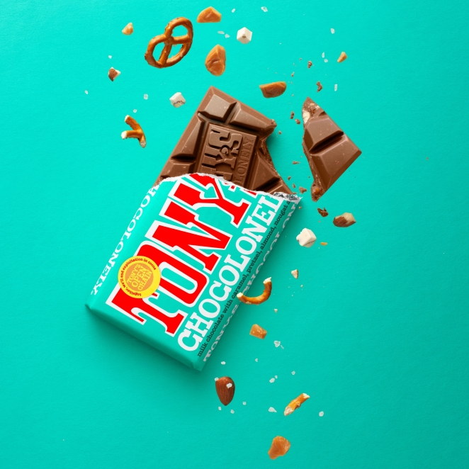
Chuck Studios looked at what makes Tony’s Chocolonely distinctive from competitors. The team decided that the chunkiness of the bar is its most iconic feature. The chunkiness is not just a size or texture; it’s a symbol of Tony’s Chocolonely’s impact, flavour and commitment to doing things differently–with its unequally divided pieces rather than traditional squares or rectangles.
Did you learn anything new during the project?
Tony’s chocolate is chunky—thick, textured, and packed with inclusions. It’s designed that way to reflect inequality: every piece is uneven, just like the world.
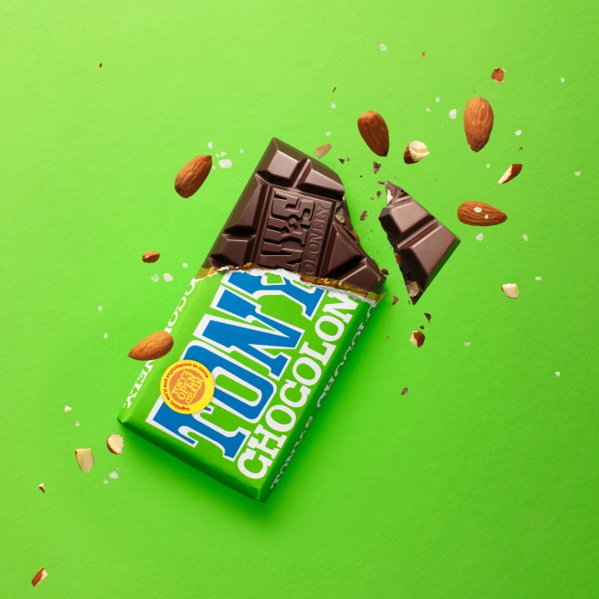
When we tested the word “chunky” with the Tony’s team, it resonated immediately. It was already part of the internal vernacular—just never formalised. We checked competitors, ran consumer interviews, and realised: no one else in the category owned this word.
Chunky became the foundation for the entire identity.
What was the biggest challenge? How did you overcome it?
Doing something that looks like chocolate, without looking like everyone else.
Most brands in the category lean heavily on tired tropes: molten chocolate waterfalls, flying shards, splashes, and drizzles. We mapped more than 100 brands and found most were variations on a theme.
But Tony’s is not like everyone else. We identified what we did not want to use and examined the product closely to find something unique.
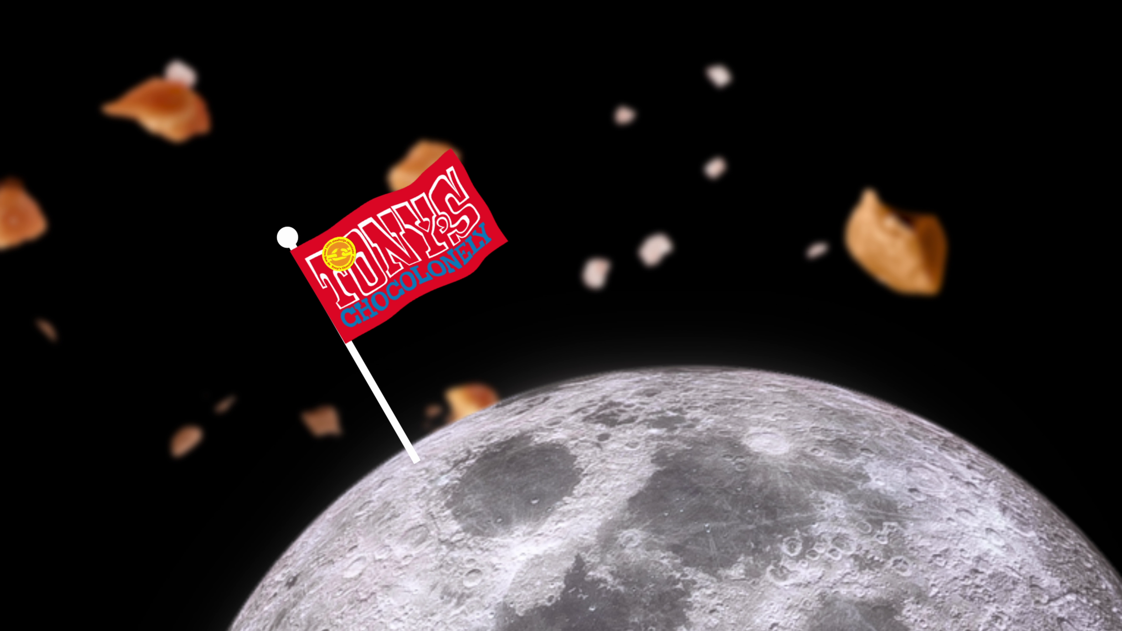
That’s when we discovered something special.
At the top right corner of every Tony’s bar, there’s a set of two extra-chunky squares. They’re the natural place to start. The piece you reach for first.
So we named it:
Neil.
After Neil Armstrong. The first man on the moon. The OG of first things.
Neil became Tony’s distinctive brand asset– the “hero bite” that anchors every depiction of the bar.
What kit/tools/software were used to create it?
At Chuck Studios, we’re makers. Unlike traditional creative agencies that predominantly use graphic design tools, we bring ideas to life with food stylists, prop masters, gaffers, DOPs, photographers, and set designers.
We play with the product. We light it, break it, melt it. For Tony’s, our food stylist was instrumental– helping us understand how to cut the bar, where the textures pop, how the inclusions behave.
It’s an approach that’s both analytical and hands-on– where craft and strategy go hand-in-hand.
What details are you most proud of and why?
To ensure this new identity lives on– consistently and globally– we codified everything into a culinary identity playbook. It includes the strategy, tone, product styling, visual codes, and, of course, Neil.
Now it sits alongside the brand guidelines– used by every partner, market, and internal team. That’s how Tony’s stays radically consistent, even as they continue to grow.
What do you hope it achieves for the brand?
The result is an identity that’s as bold and unapologetic as the brand itself. It shouts delicious in a category full of sameness– and does so in a way that only Tony’s can.
Because this isn’t just about taste.
It’s about using design and storytelling to bring meaning, mission, and flavour together in one unmistakable bar of chunky, unfairly divided chocolate.
How do you ensure consistency in brand messaging and visual identity across various channels and touchpoints?
By using the ‘Toolbox of taste’ – Codes to unconsciously build brand recognition. These are visual patterns that create consistency– how the chocolate is styled, lit, broken, or shot. They’re not consciously noticed by consumers, but they build familiarity and recognition. Tony’s Chocolonely is on a journey to shine a spotlight on its uniquely shaped chunks, propelling ‘Neil’ towards becoming a distinctive brand asset. It will be featured in every touch point to become a delicious representative of the brand and instantly recognisable as Tony’s Chocolonely.
How do you ensure consistency in brand messaging and visual identity across various channels and touchpoints?
Chuck Studios produced guidelines on how it must always be shown: broken off and never cut, never shown flat and always tilted to emphasise the shape and chunky nature, surrounded by chocolate crumbs and the filling.
Credit list for the work?
Client: Tony’s Chocolonely
Global Creative Director: Olaf van Gerwen
Art Director: Stefano Crose & Vilma Turkki
Business Lead: Robert Volten
Account Manager: Norman Tolba
Producer: Merel Brand
Production Company: Chuck’s Studios
Photographer: Kristy Snell